|
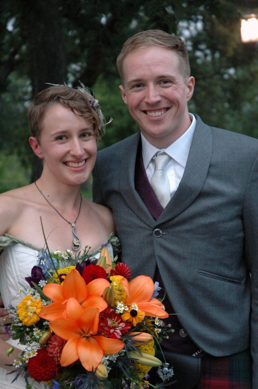
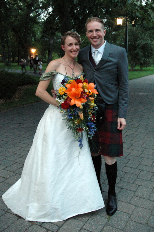
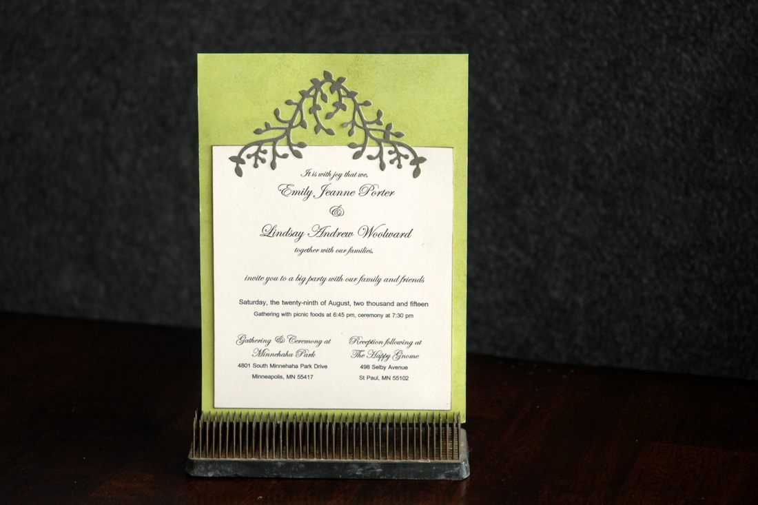
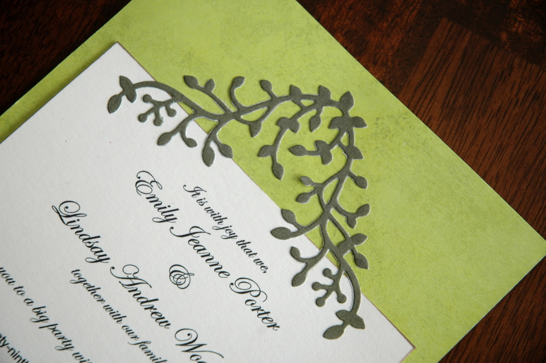
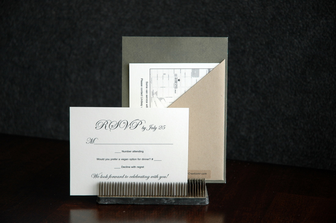
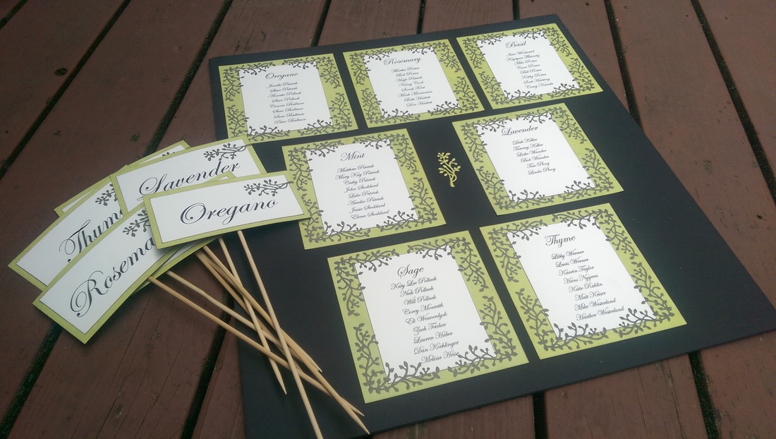
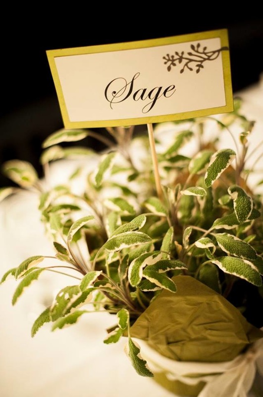
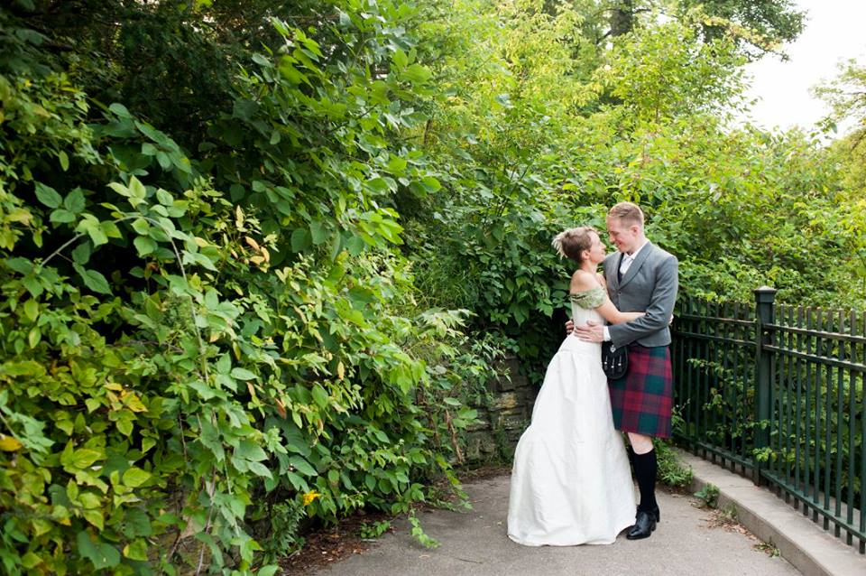
The third and final wedding of August this year (one, two) was my sister-in-law Emily and her boyfriend Lindsay. The were married at Minnehaha Falls amid stunning foliage and loving family and friends. I was so excited when they asked me to make their wedding stationary! I had already made their save-the-dates, so I knew the feel they were going for with their invitation as well. Simple, elegant, natural, and light. I found a delicate leaf die-cut to add to the top of the invitation. And I didn't even know that the ceremony site had a canopy of leaves! It was perfect! I kept the whole invitation pretty simple. I did add a pocket to the back to hold the RSVP card/envelope and an insert card for directions and information. The reception was at a fun local restaurant. Emily and Lindsay wanted assigned seating, but the meal was a buffet, so we didn't have to deal with individual seating cards. Instead, I made a poster telling everyone which table to go to. The tables were marked with different herbs. Sage, Rosemary, Thyme, etc. I also made the signs that went into the pots of the plants on the tables. And as a wedding favor, each guest got a small package of the herb on their table! I am so happy for Emily and Lindsay! I hope their life together is as beautiful and full as the amazing garden they were married in.
0 Comments
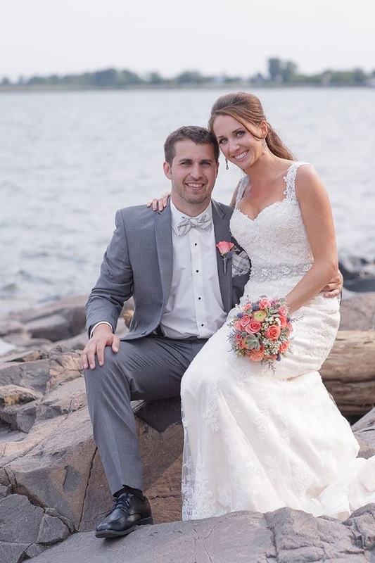
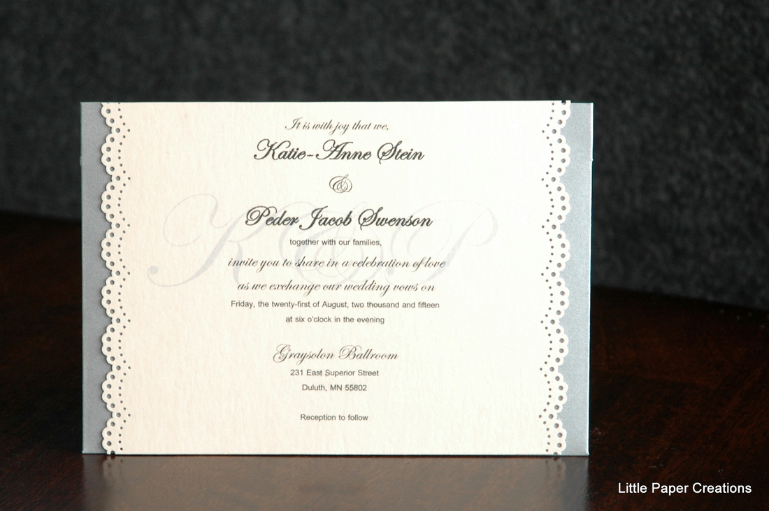
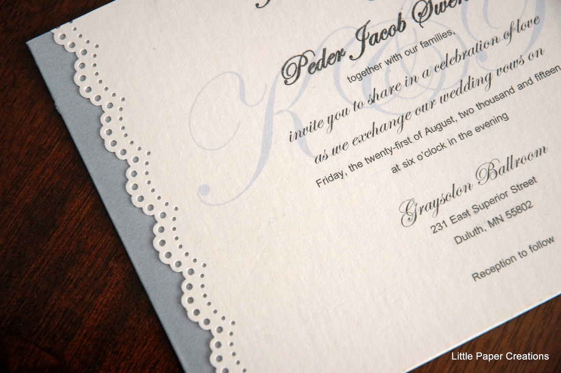
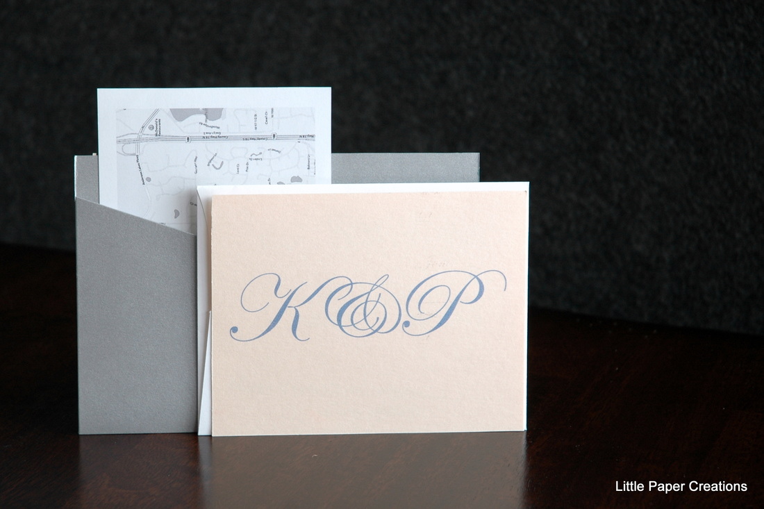
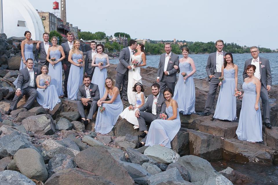
Last August was full of weddings for me. My husband and I went to 3 weddings in the span of 4 weeks! You may recall a couple of the cards I made for them. One of the weddings was for Katie and Peder. I've known Katie since I was 10. My family moved into a new house and pretty quickly met Katie and her 2 sisters who lived next door. She and my younger sister became close friends and have stayed in touch all these years. So of course we were all ecstatic when she announced her and Peder's engagement! Shortly after she got engaged, Katie got in contact with me and told me that after seeing the invitations I made for my sister's wedding in 2014, she knew that I had to make her invitations, too! Of course I said yes! The wedding colors were pink, coral, and yellow, with grey for the boys, so I found a pale grey and pale coral for the invitations. Katie chose to go with a paper-lace design with K&P watermarked behind the text. It is difficult to see in the photos, but it shows up better on the RSVP back. The back of the invitation featured a pocket to hold the RSVP, envelope, and insert card with map and directions. Everything tucked neatly inside so nothing got lost when you opened the envelope. Katie and Peder's wedding was gorgeous! The ballroom was so elegant, the decorations were fun and colorful, and the dancing was highly entertaining! And I wouldn't have expected anything less from such a fun-loving couple. Especially since their wedding party had 22 people in it! Congratulations to Katie and Peder!
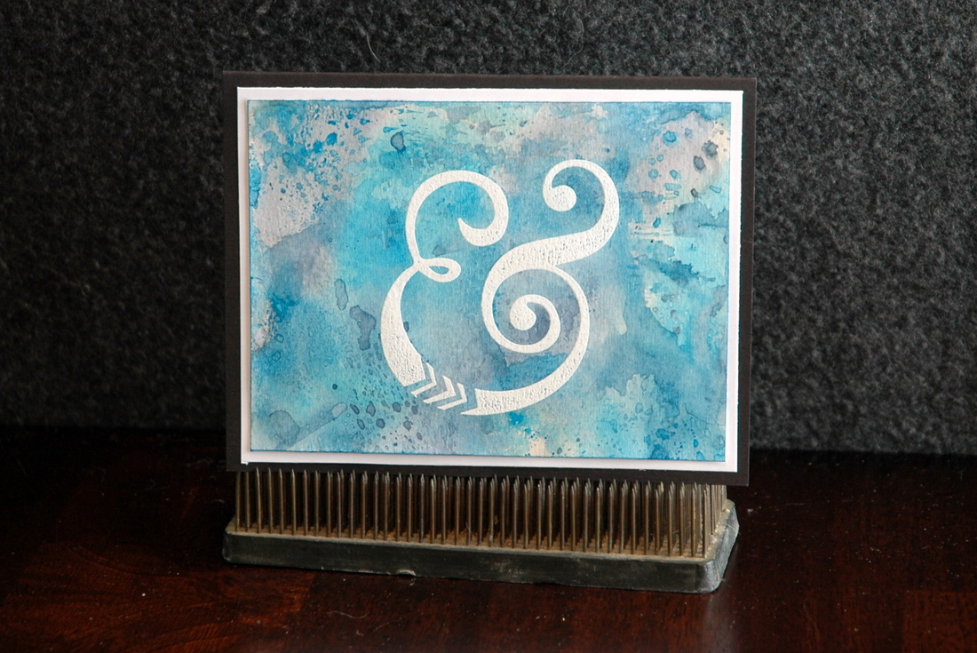
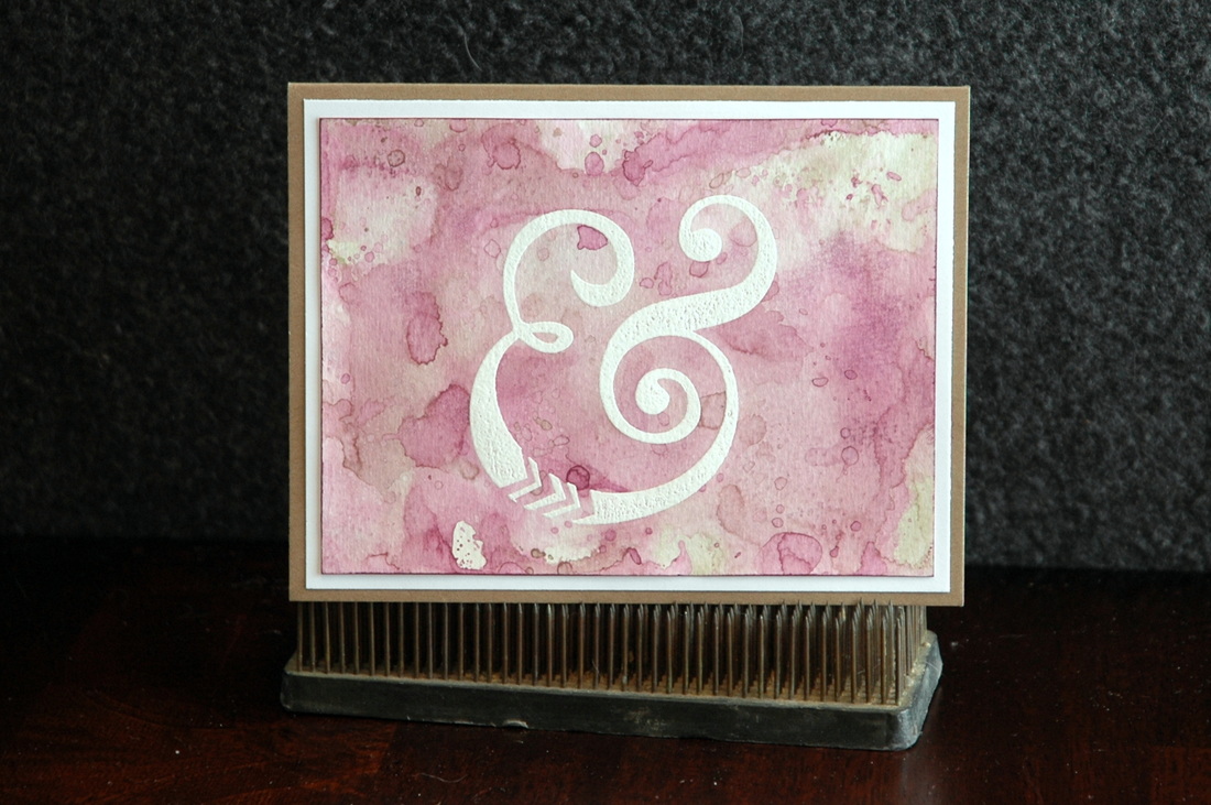
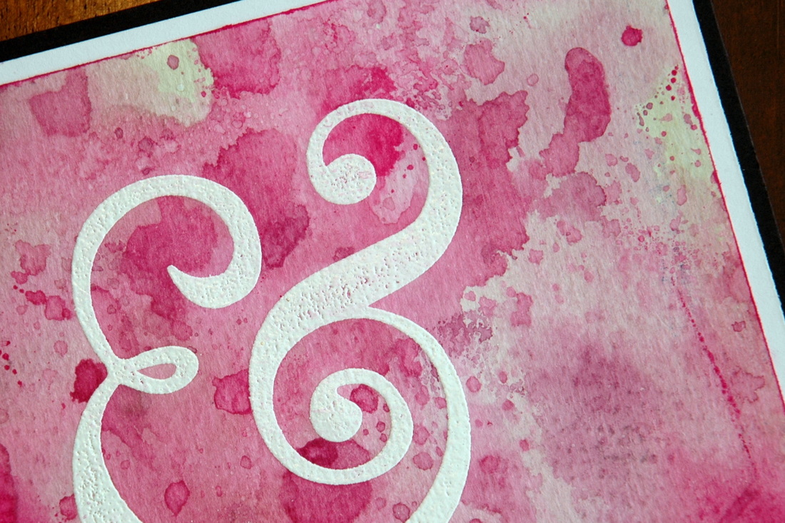
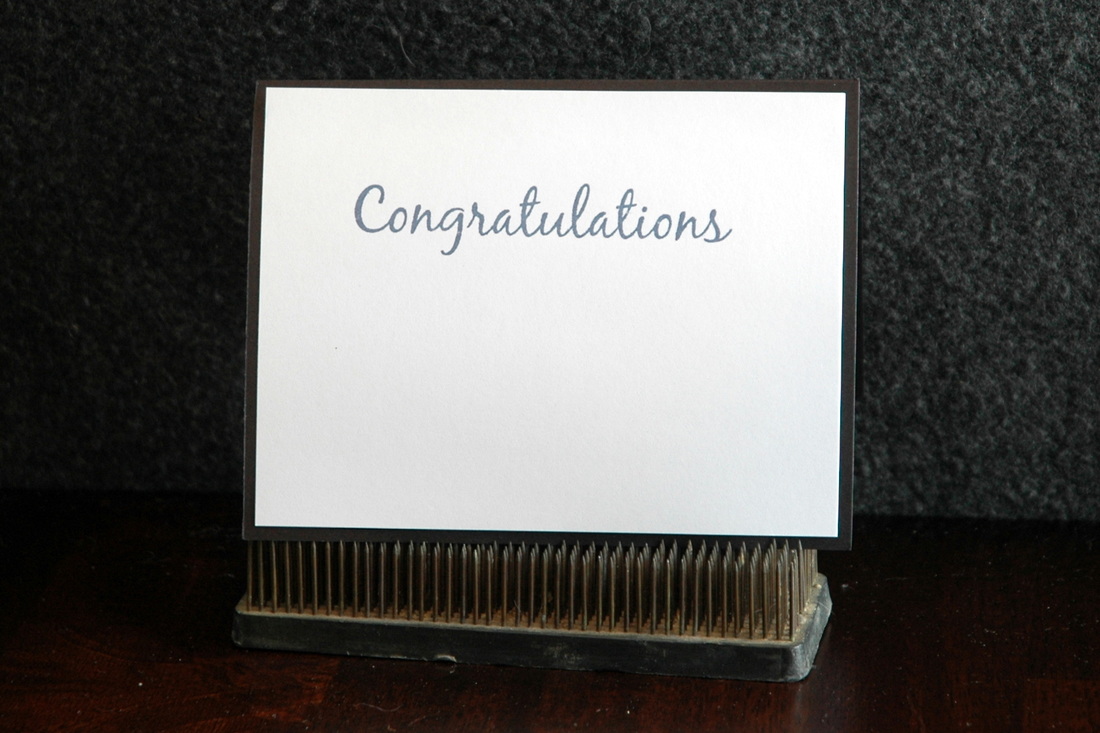
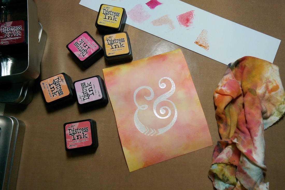
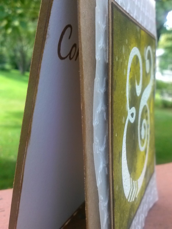
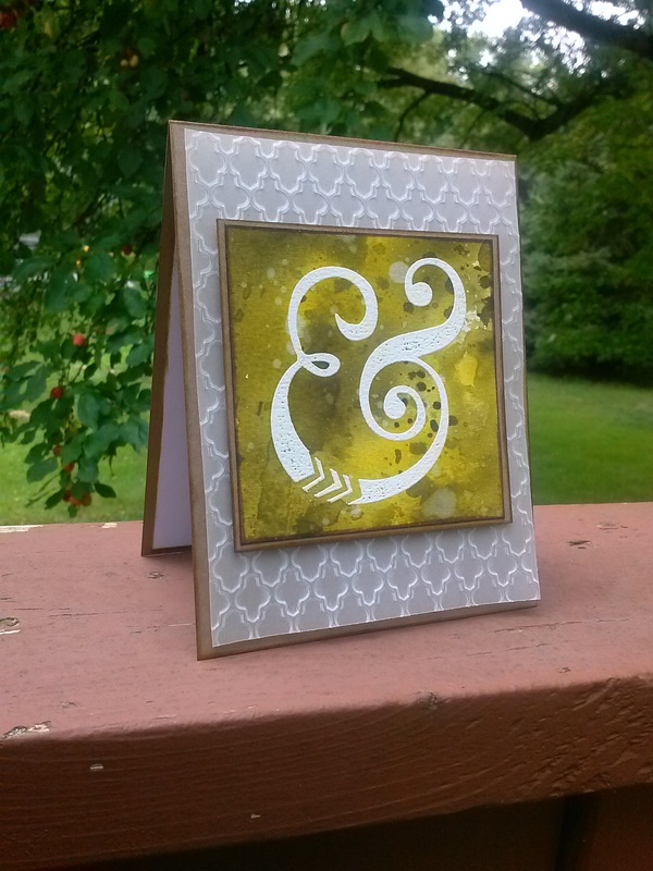
And thank you for letting me be a part of your special day! Happy Crafting! Wedding season may be several months away, but I have been playing with the "&" stamp that I used on the wedding cards I made last summer. I heat-embossed the stamped image with white embossing powder, then used distress inks (we all know how much I love those!) to make a colorful watercolor-like background. Some simple matting, and voila! Cards ready for any wedding! What I really like about this design is that I can make it in any color combination I want - making it really easy to customize the card to the wedding! I made a blue, a lavender/pale pink, and a bright pink to begin with. I think those are pretty generic wedding colors, right? I stamped the inside with a 'Congratulations' in a matching color of ink. I have these listed on Etsy right now, but if you'd like one in a different color combination, just let me know and I can make one just for your special occasion!
Thanks for stopping by! Happy Crafting! Have you ever had a vision of how something would turn out and you got so excited you couldn't wait to get started and you worked really hard on it and then it didn't turn out anything like what you have envisioned? If you said no, you're a liar. ^_^ It happens to me all the time. And most of the time, I scrap it or start over or just walk away. But this time I couldn't. This time I had an out of town wedding that we were leaving for the next day and I had no more time to make another card. So I stuck with it. The color I had envisioned kept alluding me. I could not get my distress inks to do what I wanted! But I kept adding more layers. I kept trying more colors. I pushed through till I got the result I had set out to get. And you know what? It felt really, really good when the color finally showed up. When I finally got what I wanted, I was too tired to come up with an all new design, so I stuck with the one I made for a previous wedding card and took out some vellum and matching paper to finish up this card. I really love this card. It matches the invitations perfectly (which I made - post coming soon!) and there's nothing quite like the triumph of working through crafting adversity. (How's that for dramatic!) What do you do when a project doesn't turn out the way you envisioned it? Do you scrap it? Start over? Keep going? Throw it out the window and eat some chocolate? ^_^
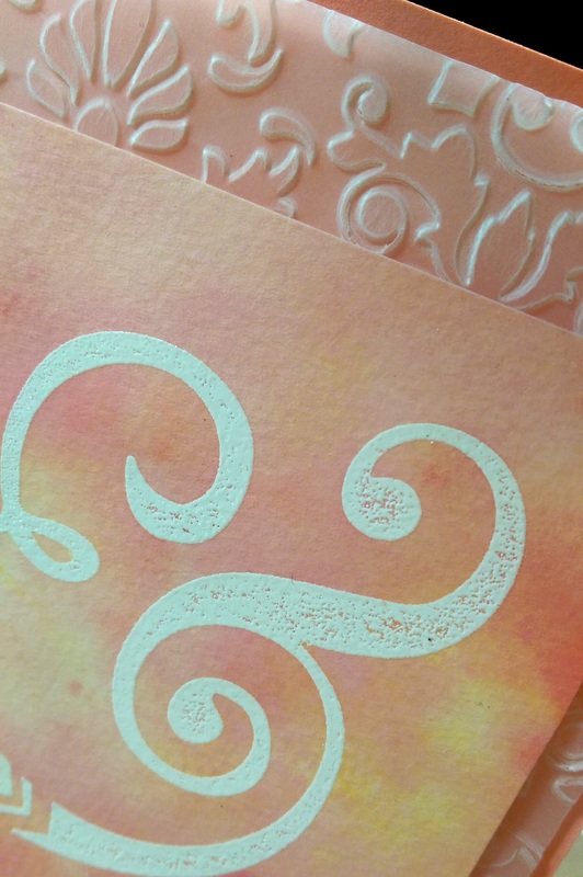
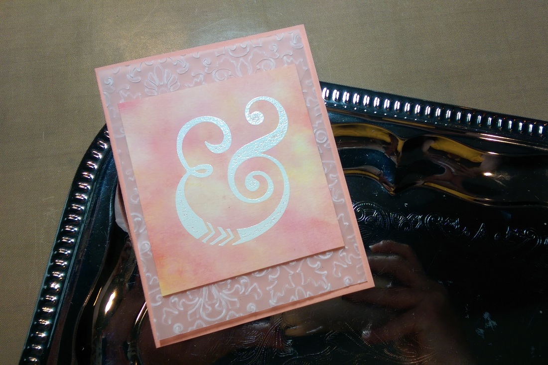
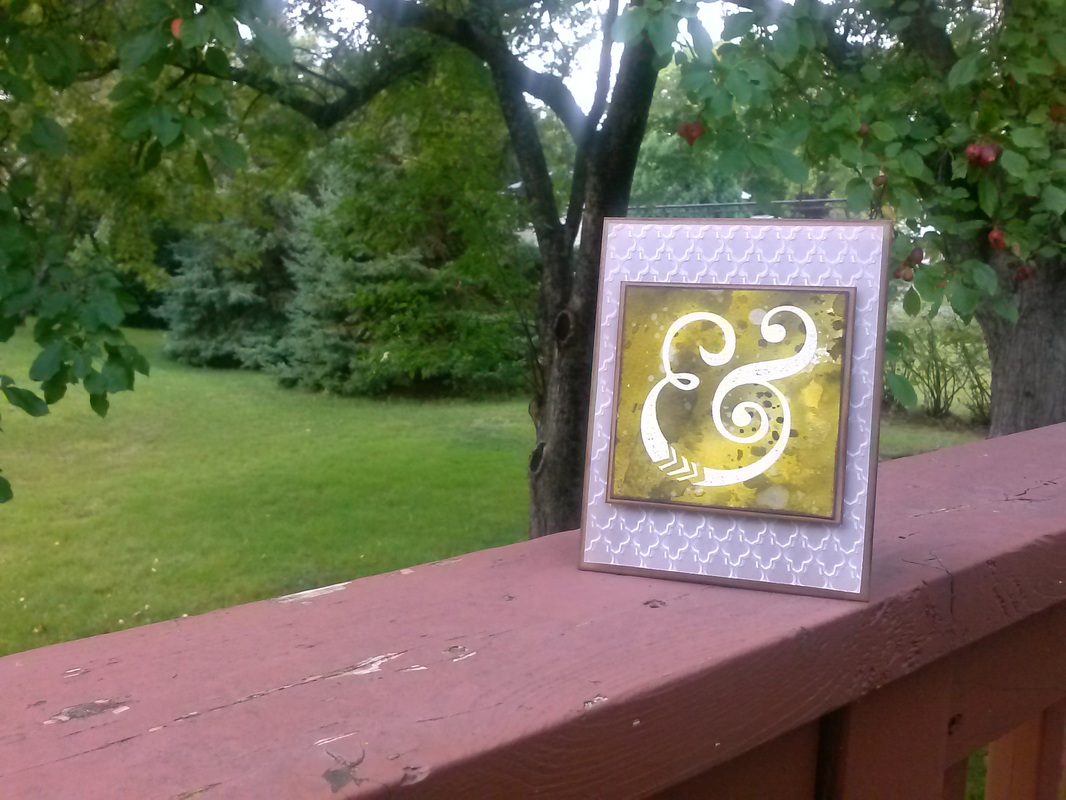
Happy Crafting! August 2015 will forever be known in our house as "The August of Insanity!" Of the 5 weekends (technically) in August, 1 was full of birthday celebrations for my mom and sister and 3 were full of weddings. Yes 3. And one hasn't even happened yet! At least I had one August weekend off. Though I used that weekend for dress shopping for the weddings... With so many events coming up, I knew I would have to make some cards. Here is the first on I made: a wedding card for the first wedding. I know it doesn't look like a traditional wedding card, but the couple that were married are very outdoors-y, so I thought I should go with a lightly 'camo' look. I white heat embossed the large ampersand, then used distress inks and my favorite 'smooshing' technique to create the center piece. The piece behind it is dry embossed vellum. I love how it turned out! All the softness of vellum, but with a unique texture. I mounted both layers with foam tape onto a top-folding kraft cardstock base. A quick "Congratulations" stamp on the inside, and the card was complete! I really like how it turned out, I think I'm going to use this design for some more wedding cards! It's super customizable, so I can use the wedding colors for each couple.
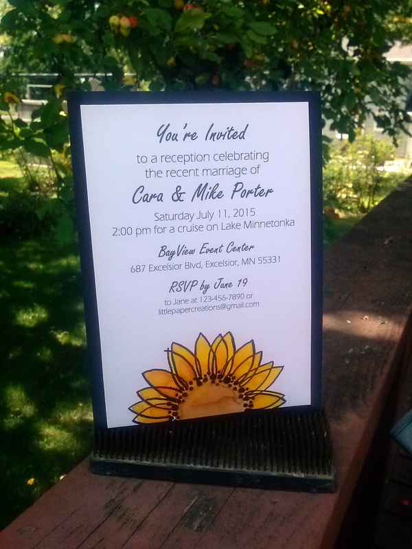
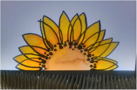
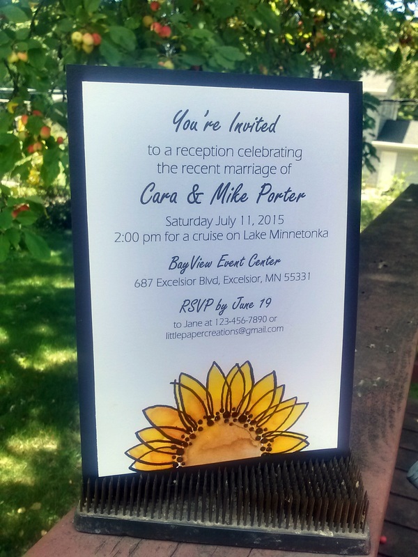
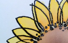
Happy Crafting! A wedding doesn't always have to be a big, expensive, extravagant event. One of my brides, Marie, chose to do a small destination wedding and have a local reception a few months later. Her mother (who is a friend of my parents) contacted me last spring about making the invitations for the local reception. Of course I jumped at the chance! Marie had sunflowers at her wedding, so I wanted to find a way to incorporate those into the design of the invitation without getting too 'theme-y'. Is that a word? It is now! The mother of the bride and I settled on this design; bold and elegant, but simple and fun. I love it! (Names and contact info have been changed on the invitation to insure privacy) As you should know by now, I'm slightly obsessed with distress inks. I was so excited to be able to incorporate them into this project to create a soft watercolor look. I heat embossed the sunflower stamp with black embossing powder, then used the distress inks and a paintbrush to paint the sunflower with bright yellows and oranges. A few things I learned from this project: 1) Watercolor paper is really the best thing to use with any technique that uses water. Unfortunately, I haven't found a watercolor paper that goes through the printer and shows the printing well, so I used a heavy cardstock. It worked well and they looked great, but I'd love to find a 'printable' watercolor paper. 2) Along those lines - don't overwork the colors. I had to be careful with my brush to avoid the paper from pilling with the amount of water I was using, which was good because the more I messed with the colors, the less I liked the outcome. Less is more! 3) If you are using black embossing powder, do yourself a HUGE favor and use an anti-static powder tool. For some reason, black embossing powder sticks to EVERYTHING!!! Another option is to use black ink and clear embossing powder. 4) If everything is not dry before you start to assemble, it will smear and you will have to do it over. Ask me how I know... Congratulations to Marie and Matt on their wedding, their reception, and beginning their life together!
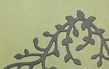
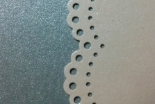
Happy Crafting! I've been hard at work lately on some exciting projects! I have 3 weddings this summer that I have the privilege of designing for. I can't reveal their designs yet, but I can offer a great big CONGRATULATIONS to the newest Little Paper Creations couples. My sister-in-law Emily and her fiance Lindsay are getting married this August. I made their save-the-dates a few months ago, and now I'm hard at work on their invitations. Here's a sneak peek at their design: A childhood friend is also getting married this August, and I was flattered and thrilled when she said she wanted me to design her wedding invitations! Katie and Peder are having a large wedding, so I'm working really hard on their many, many invitations, but I'm having a blast! Here's a sneak peek at their design: The third wedding I'm creating for is actually a reception, not s full wedding. The couple was married a few months ago out of state and they are having a local reception, so they asked me to create some invitations for that. It's coming up soon, so I'll have a full post on the invitations later, but until then, here's a sneak peek of their design: For every event I am asked to create for, I make 3-5 samples for the client to choose from. When they choose a design, we tweak it so it's perfect and then I can make the entire order. I really enjoy making a unique, personal design for each person. And every time I make a new design, I learn something new. I love to learn, I love to create, and I love to share my creations with the world.
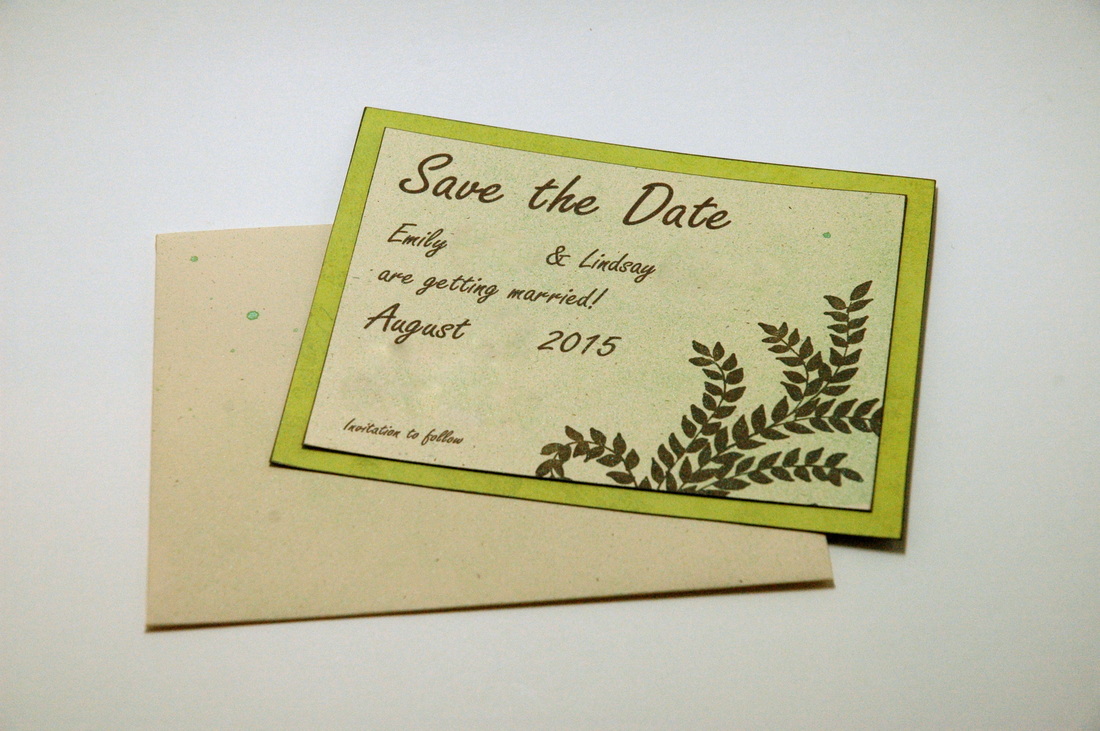
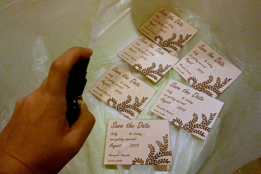
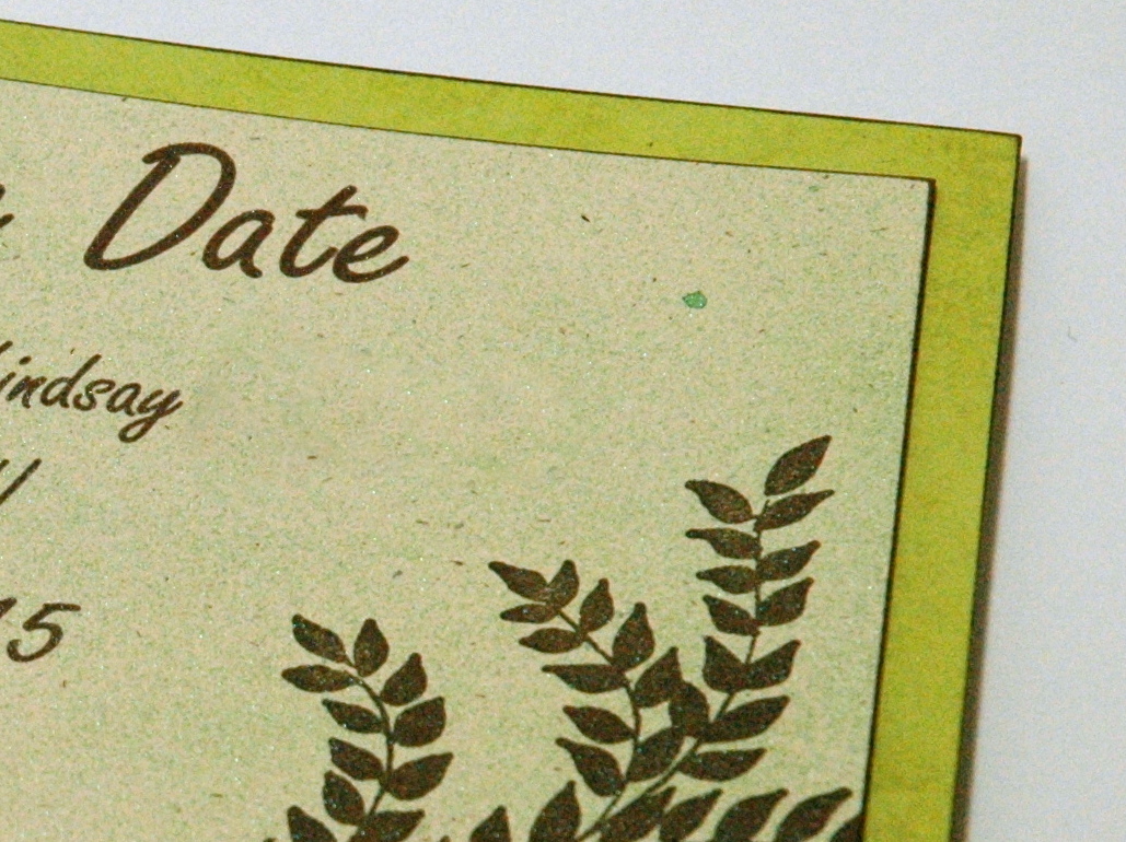
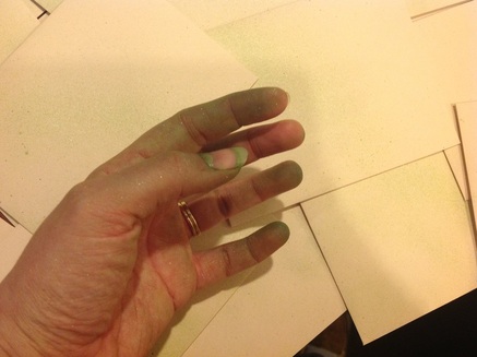
I'll have more details about these invitations as they happen. I do not post about one of my designs till they are in the hands of the guests or the event has happened. The guests should always see them first. Do you have any big events coming up this summer? We've got 3 weddings, our anniversary, 5 family birthdays, Father's Day, and 4th of July, plus whatever else comes up. And oh yeah, we have full time jobs too. Wow, this is going to be one busy summer! Happy Crafting! It's time for another family wedding! This time, it's my husband's sister (we both have 1 younger sister). Emily and her boyfriend Lindsay got engaged in Hawaii last fall and are getting married this summer! I love weddings, but I LOVE family weddings! It's so much more fun when you are related to the bride or groom and it's the best when you get to be involved in the planning. To me, at least. And I am super excited that I get to help create another wedding vision for another family member! We began with save-the-dates. Their wedding is going to be pretty small, around 100 guests, so I only had to make 55 save-the-dates. Which is still a good amount, but after Erin's wedding last summer with about 150 invitations, 55 seems light! Emily and Lindsay want a natural/fresh feel to their wedding, so we went with bright spring green and some earthy browns. I found a fern stamp that works well as a corner accent, and used brown ink for that and the text. (I've blurred out names and locations for privacy - I forgot to make one with fake info) I decided that the save-the-dates needed a little something more after I had done all the printing and stamping, so I pulled out some bright green spray ink. I've had this stuff in my craft room for years and never really used it before (I wasn't a messy crafter until recently), but it seemed like the perfect addition. I set up a spray-tent and went to work. The green spray ink was just what these save-the-dates needed to really make them pop! Here's a close-up of the green spray. It's got a slight shimmer to it that really catches the light in person. It was hard to capture it in a photo. I also decided to spritz the envelopes, and by the time I was finished with everything, my fingers were dyed bright green! Emily and Lindsay loved them, and I am very excited to make their invitations and other wedding details in the upcoming months. I will have a full run-down of their stationary in the fall after the wedding.
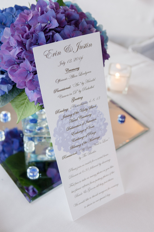
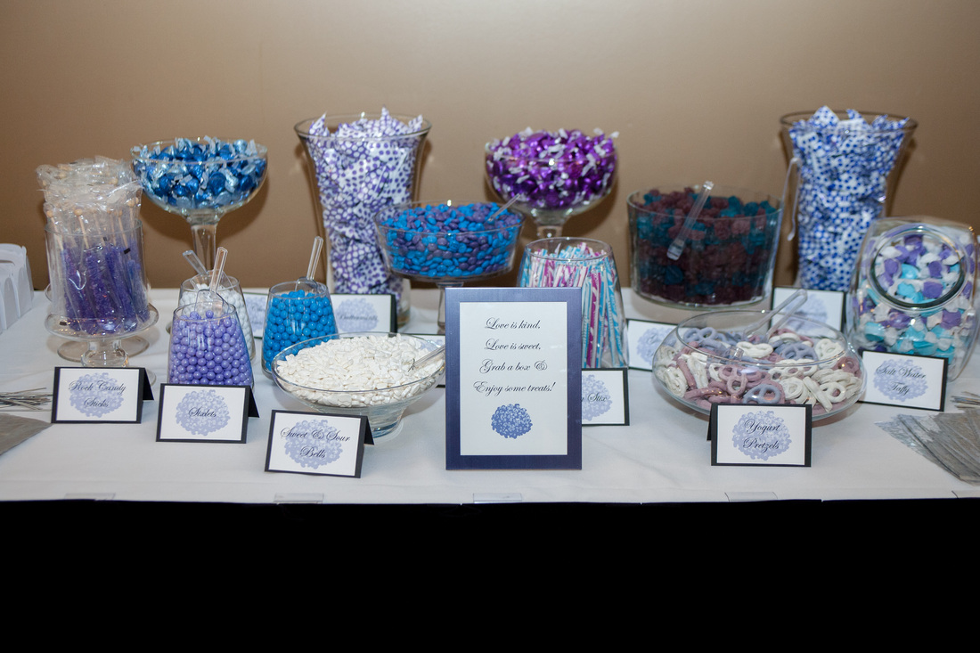
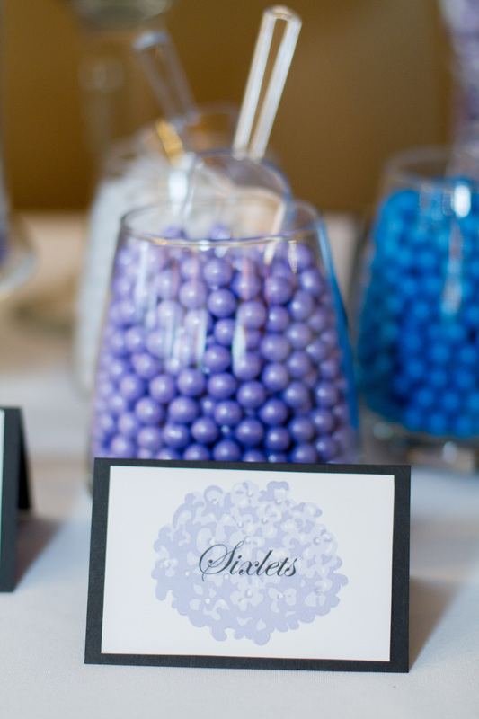
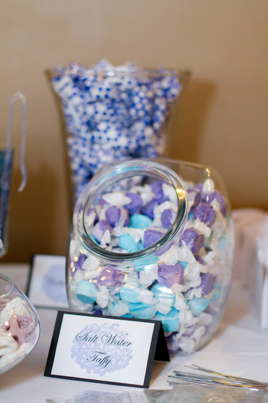
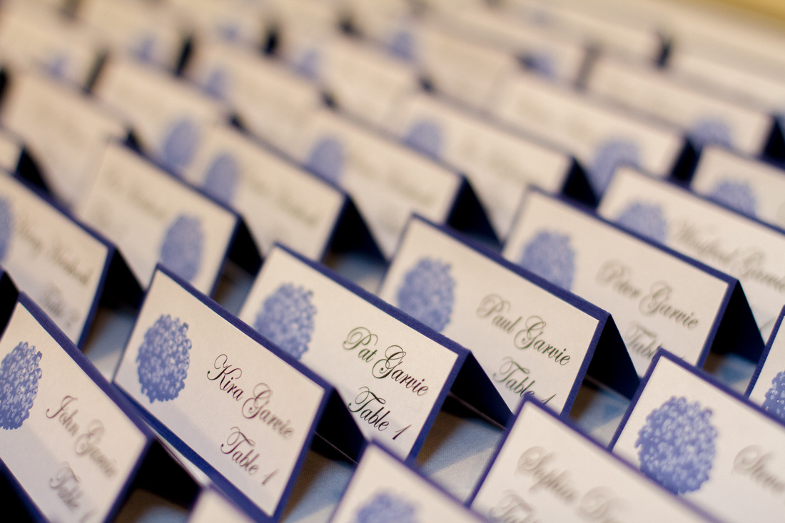
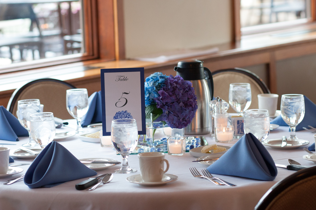
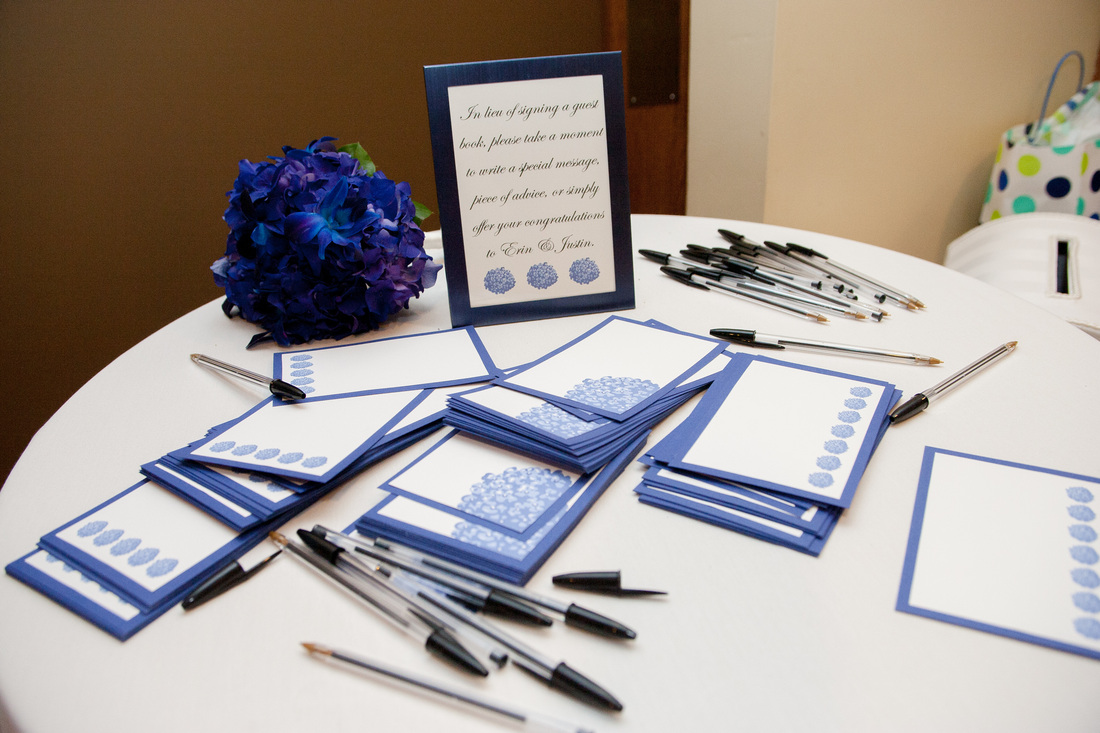
It seems like there are a lot of weddings this summer - we've received save-the-dates to three weddings already! Is anyone else going to any weddings this summer? Or maybe hosting your own? Are you DIY-ing any part of it? Happy Crafting! Last week, I shared with you my sister's wedding invitations and thank you cards. This week, I'm going to share the rest of the stationary I made for her wedding. Erin's Wedding Stationary Extravaganza! Part 2: Programs and Reception Details Once I figured out that I could scan and digitally manipulate the hydrangea stamp image I'd been using on the invitations (etc), I got really excited about making all the reception details! I began with the programs. I printed them on 4 1/4 x 11 inch paper that had some shine/shimmer to it. Because who doesn't love some bling and glam on their wedding day? The front has the ceremony program and the back has the wedding party and other information. Both sides have a light hydrangea printed under the text. I was so happy at how the hydrangea came out! It was the perfect accent; it added to the feel and design of the program without distracting the reader from the text. I know many of you don't know my sister personally, but trust me when I say, it would not be Erin's wedding without a lot of good food. Specifically, a lot of good sweets. So we put together a candy bar! My mom worked hard to find a large variety of blue and purple candy and all the lovely glass containers to serve it all. I made all the signs so people would know which variation of sugar they were feasting upon. Next up were the table signs and seating cards. The seating cards were tricky because they needed to be small enough to be unobtrusive on the tables, large enough to be easily read, and they needed to have some way to denote if the guest had ordered chicken or beef for dinner. Which I guess is usually done by having two different colors. But I didn't have 2 colors to work with. Unless you count black. Which I do not. So what I came up with was printing the small hydrangea on either the left or right side to denote their dinner choice. Chicken on the right, beef on the left. And no, that was not an arbitrary choice. 'Beef' has 4 letters, as does 'left'. There's always a method to my madness! The final, but most lasting, part of Erin's stationary were the reception cards. I have always thought that guest books are kind of dumb. I mean, you invited these people, you know who was at your wedding, you don't need their signatures to prove it! So for my own wedding (back in 2007), I came up with the idea of reception cards. They are 4x6 cards on which guests can write well-wishes, advice, jokes, or congratulatory messages. When you have collected them all, just slip them into a photo album and you're done! These are so much more personal and fun to look back on than a guest book. Plus, after a few glasses of wine, some of the guests can be pretty hilarious!!! I created 3 different designs so guests could decide which card(s) they wanted. Erin and Justin had a great time reading through them the next day at the gift opening! Well, that about wraps up my sister's wedding! I hope you enjoyed reading about it as much as I enjoyed creating for it. Actually, there's no way that's possible - I had an absolute blast making everything for my sister! It was a lot of work, but totally worth it to see how much Erin, Justin, and all their guests enjoyed all the details that went into their special day. I also learned a lot about creating coordinating designs in large quantities. I am very excited to help other brides realize their wedding visions, and I've actually got 2 brides lined up already! More details coming soon! Thank you for reading, and Happy Crafting! ** All photos in this post are from Bellagala Photography **
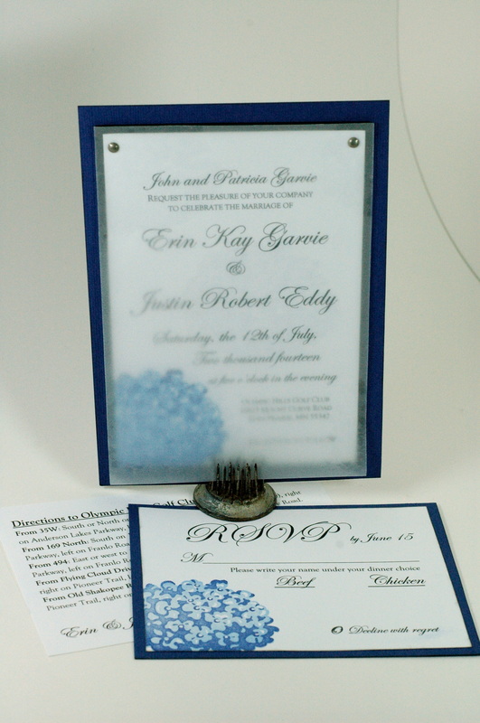
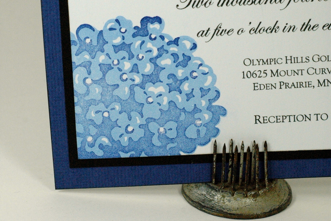
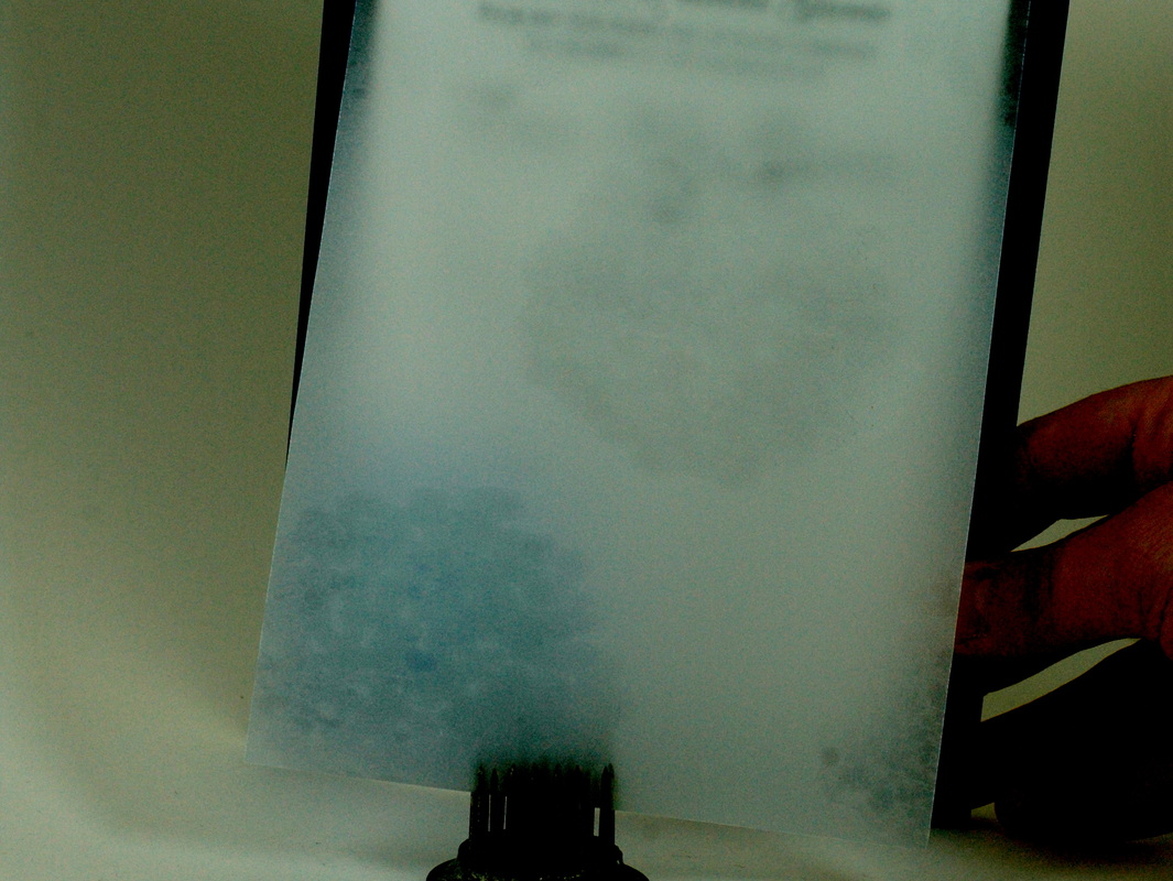
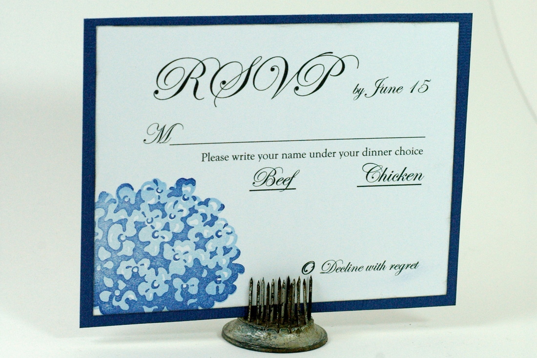
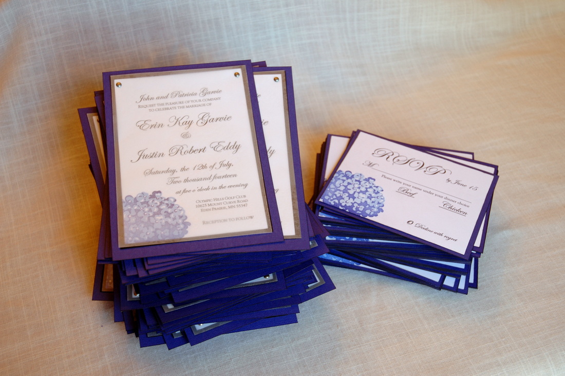
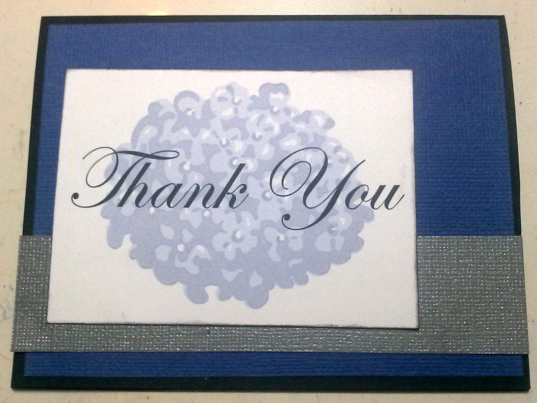
My sister got married! The wedding was in July and it was so amazing! My mom and I helped Erin with a lot of the wedding prep, including decorations, organization, vendor details, and of course wedding stationary! I made her save-the-dates, invitations, thank you cards, programs, seating cards, table signs, candy table signs, and guest book/advice cards. By the time I was done with everything, I was kinda tired of looking at periwinkle and hydrangeas. Which is why it has taken me this long to get this post up. But now that I've had some time away from periwinkle and I've done some other projects, I am excited to show you my largest (and most fun!) project to date. Presenting... Erin's Wedding Stationary Extravaganza! Part 1: Invitations and Wedding Thank You cards Since I had already made her save-the-dates, I kind of knew what layout I would use for the invitations. I printed the text, stamped the double-stamp hydrangea in the corner, matted on black cardstock, and attached stamped vellum over the top. Here's a close-up of the double-stamped hydrangea. I go over the details of the double stamping in my save-the-dates post. I had to print out a lot of trials before finding the exact right curve for the text to go around the stamp. The vellum overlay had hydrangeas stamped with clear ink. It made a watermark image on the vellum that looked really neat in person, but would not photograph for me! I had to really distort the colors in this picture so I could show the slight watermarked image on the vellum. I then attached the vellum to the invitation with small silver brads. The RSVP cards are almost identical to the save-the-date cards, and the direction cards are just printed on white cardstock. Erin and I had similarly-sized weddings, and I did make all the invitations for my own wedding, but oh my, this was a big project! I made 145 invitations and RSVPs when all was said and done, and I only have 2 left over for my portfolio! It wasn't until I had finished all 100 save-the-dates, 145 invitations, and 145 RSVPs that I had the genius idea to scan the stamped hydrangea and just print it on the paper with the text. *face palm* So that's what I did for the thank you cards. Which made it a million times easier, especially because I had to make 100 of those! I enjoyed adding a little bit of digital design into some traditional paper cards. It let me get the exact look I wanted without worrying about variables like ink coverage and user error lining up the images. I used the same periwinkle and black cardstocks from the invitations, but I added some silver cardstock as well. Erin loved how her stationary turned out and I am pretty pleased as well!
Check back next week and I'll have Part 2 of Erin's Wedding Stationary Extravaganza! Until then, Happy Crafting! |
Blogs I read:
Becky Higgins Bits & Pieces KWerner Designs Jennifer McGuire Ink I Could Make That Linny's Vault Pintester Categories
All
Archives
February 2016
|
 RSS Feed
